“A LA BRAVA REBRAND”
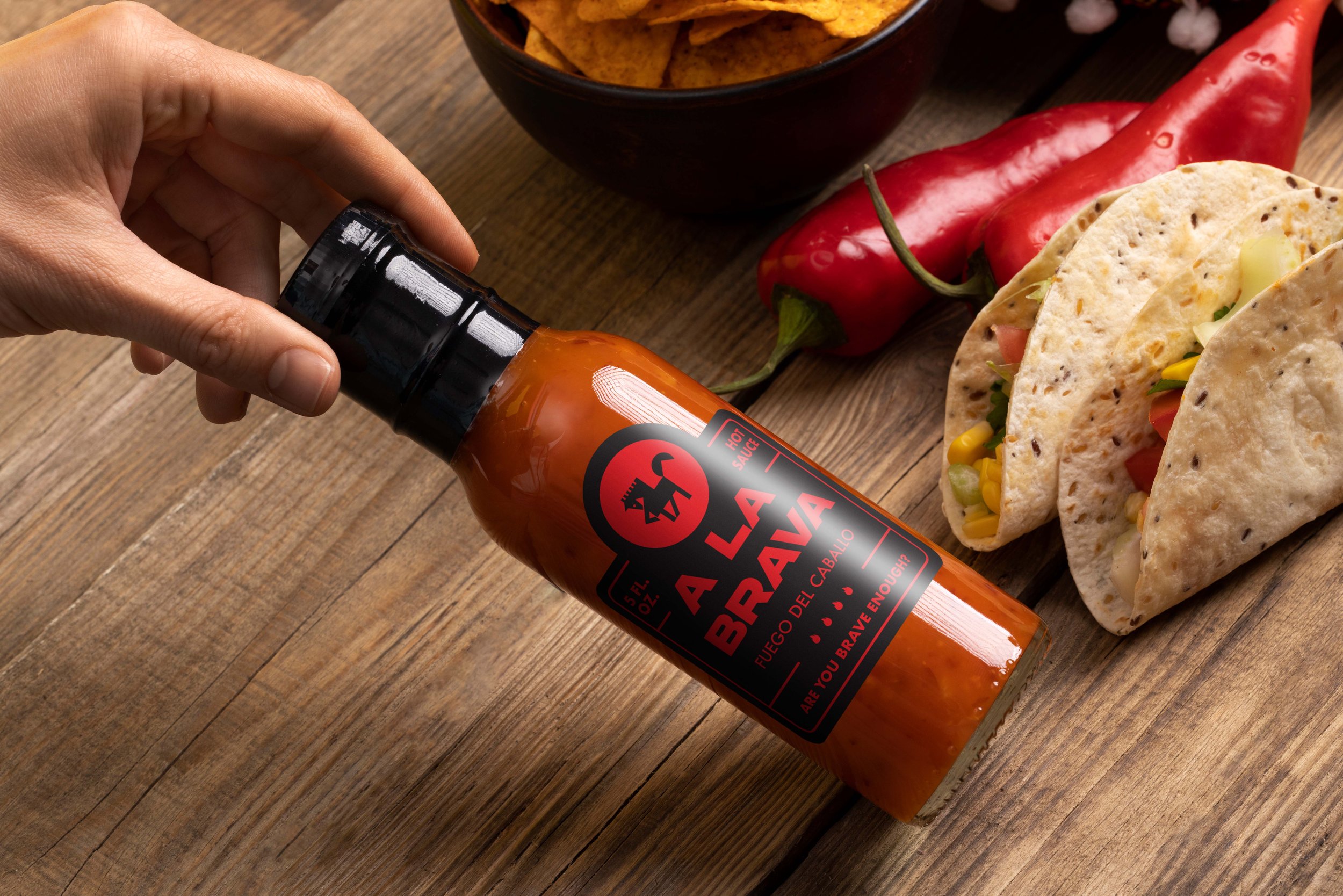
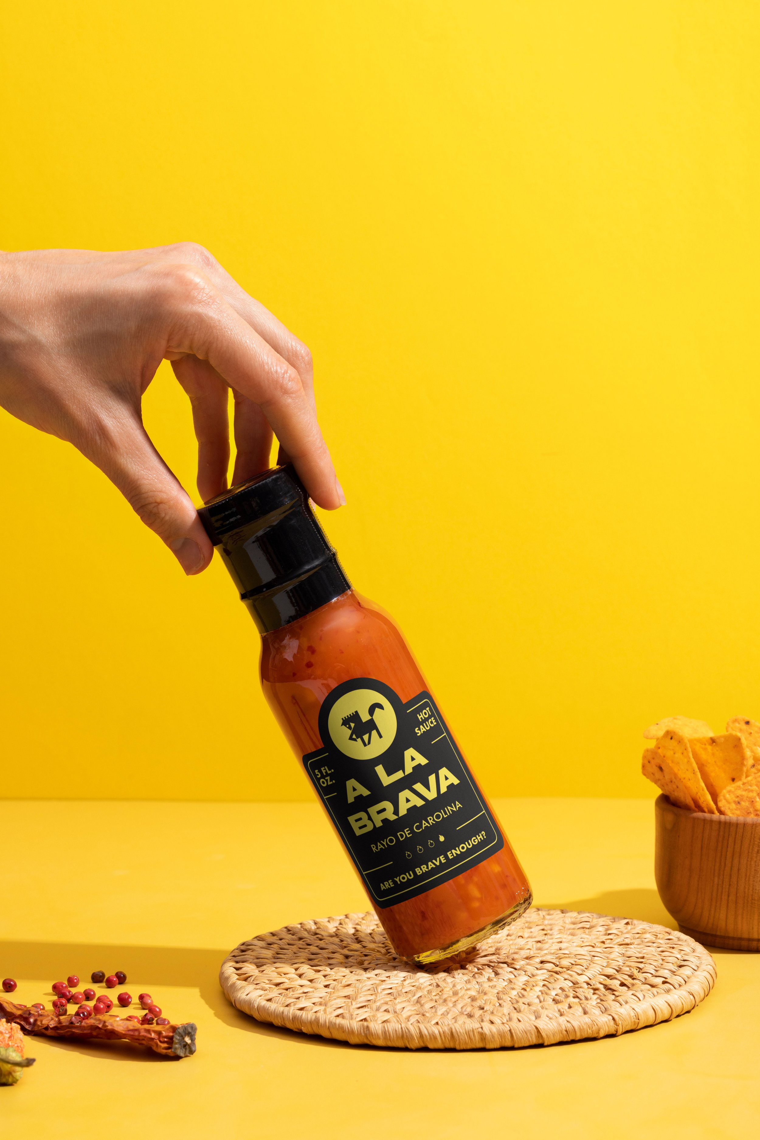
This project challenged me to revamp an existing hot sauce brand, "A La Brava." The original packaging felt outdated and lacked the "collectability" factor I see on popular hot sauce shows. My goal was to create a modern design that feels both high-quality and locally sourced. Through research, I discovered the brand's popularity, prompting a design shift away from homemade aesthetics. By simplifying the color palette and opting for a rounder bottle, I aimed for a more eye-catching and shelf-worthy product.
DON'T BE SHY, CLICK!

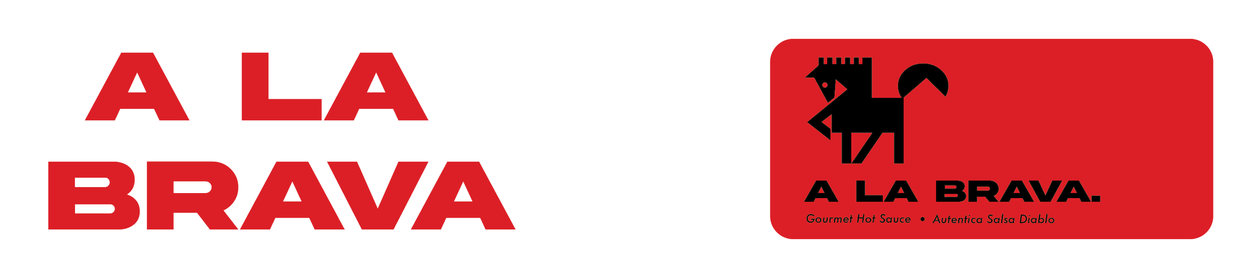
MAIN LOGO

BRANDING COLORS
TYPEOGRAPHY

DESIGN ELEMENTS
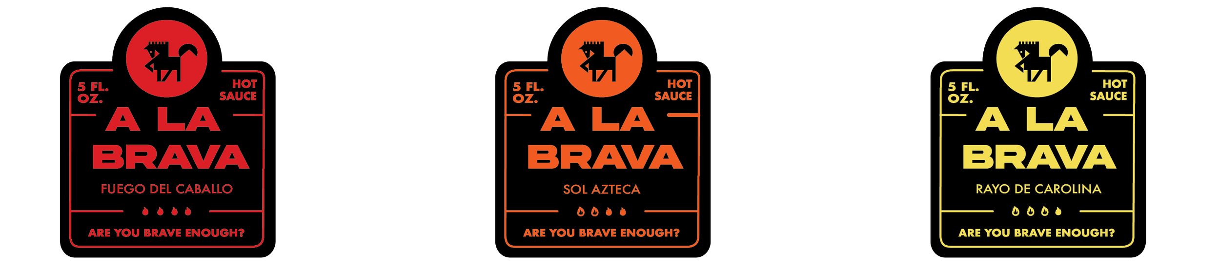
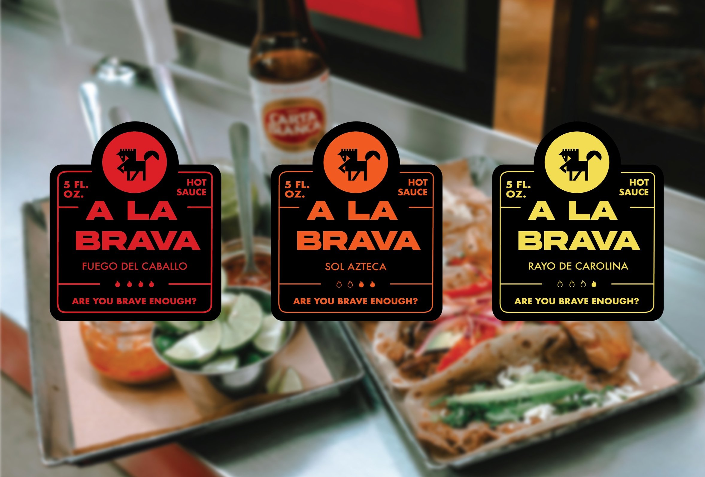
ALTERNATIVE FLAVOR COLORS
ALTERNATIVE LOGOS